library("colorpath")
library("purrr")
library("glue")
library("ggplot2")
library("tibble")
library("dplyr")
#>
#> Attaching package: 'dplyr'
#> The following objects are masked from 'package:stats':
#>
#>     filter, lag
#> The following objects are masked from 'package:base':
#>
#>     intersect, setdiff, setequal, union
library("scales")
#>
#> Attaching package: 'scales'
#> The following object is masked from 'package:purrr':
#>
#>     discard
The goal of this vignette is to show a way of building a categorical color-palette:
- eight colors
- paired (four sets of two)
- designed to be useful under color-vision deficiency
We will use the four surfaces introduced in the surfaces vignette.
# TODO: find a more-robust way to keep this in sync.
colors <- list(
  blues = c("#42B4E6", "#0087CD"),
  oranges = c("#E47F00", "#702407"),
  greens = c("#007626", "#70E07C"),
  purples = c("#3D1152", "#C530FF")
)

surfaces <- purrr::map(colors, pth_new_surface, transformer = pth_to_jzazbz100)
We can look at how the outer edge of these surfaces “collapse” under color-vision deficiency:
Next, we can plot these colors in polar coordinates, using pth_plot_polar():
pth_plot_polar(mat_surfaces, cvd = pth_cvd_grid_full()) +
  facet_grid(
    rows = vars(condition),
    cols = vars(severity),
    labeller = labeller(severity = label_both)
  ) +
  ggtitle(
    label = "Outer (chroma) edge of surfaces, simulating color-vision deficiency",
    subtitle = glue("Color space: {pth_colorspace_name(mat_surfaces)}")
  )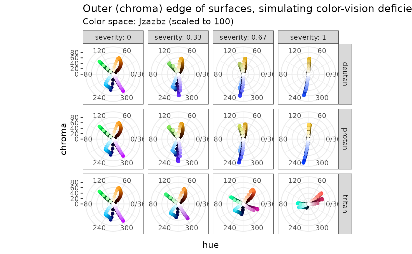
I am going to propose a design frameowrk, based on deuteranopia, because:
- deuteranopia (green deficiency) is the predominant form of color-vision deficiency.
- it manifests itself similarly to protanopia.
- tritanopia still seems to leave some variation in hue.
In short, I propose to choose:
- two blues and two purples in such a way that these colors do not collide under deuteranopia.
- two greens and two oranges, also not to collide under deuteranopia.
It is clear that under full deuteranopia, for blues and purples, there is no variation in hue. Therefore, we will have to make things different using luminance and chroma.
blues_purples_first <-
  tribble(
        ~name, ~luminance, ~saturation,
      "blues",       80.0,        1.00,
    "purples",       65.0,        1.00,
    "purples",       45.0,        1.00,
      "blues",       30.0,        1.00
  )
get_color_cat_surfaces <- function(name, luminance, saturation = 1) {
  pth_color_sfclumsat(surfaces[[name]], luminance, saturation)
}
blues_purples_cvd <-
  pth_data_cvd(
    blues_purples_mat,
    cvd = pth_cvd_grid(
      condition = c("deutan", "protan"),
      severity = seq(0, 1, 0.1)
    )
  )
pth_plot_lumchroma(blues_purples_cvd)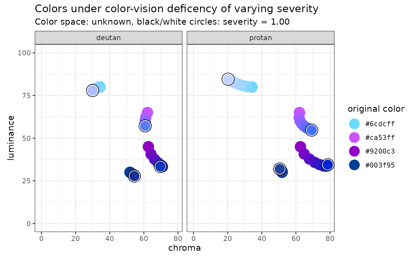
Here, we can see the measures we can take to keep these four colors more separated. We can see that, according to the color-vision deficiency models, the colors with the purple hue drop in luminance (and increase in chroma) as the severity increases.
With this in mind, we can choose the “original” colors to improve the separation at maximum severity.
blues_purples_second <-
  tribble(
        ~name, ~luminance, ~saturation,
      "blues",       75.0,        0.75,
    "purples",       65.0,        0.77,
    "purples",       35.0,        1.00,
      "blues",       45.0,        1.00
  )
blues_purples_cvd_second <-
  pth_data_cvd(
    blues_purples_mat_second,
    cvd = pth_cvd_grid(
      condition = c("deutan", "protan"),
      severity = seq(0, 1, 0.1)
    )
  )
pth_plot_lumchroma(blues_purples_cvd_second)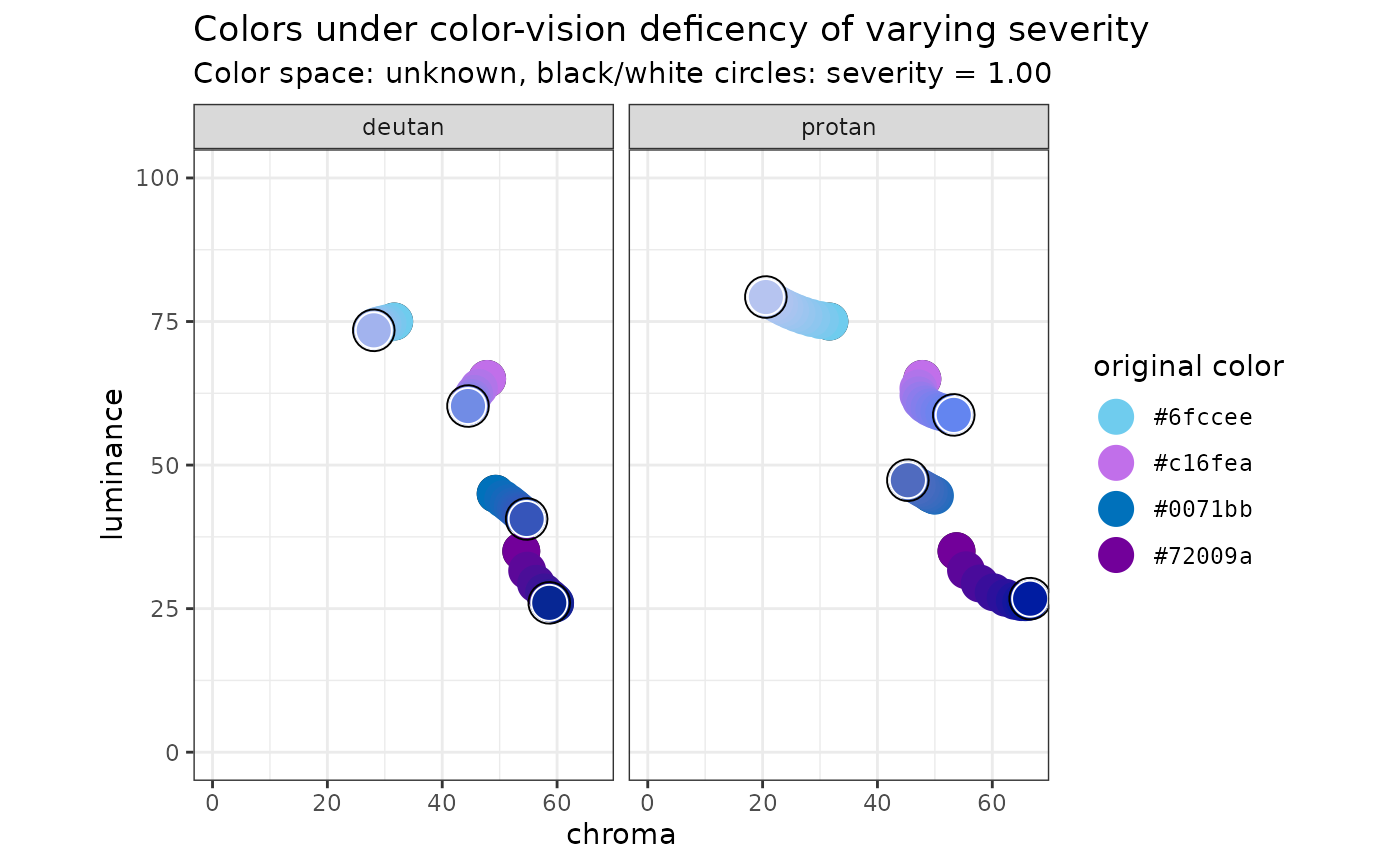
We can do the same thing with greens and oranges:
greens_oranges <-
  tribble(
        ~name, ~luminance, ~saturation,
     "greens",       65.0,        0.65,
    "oranges",       65.0,        0.90,
    "oranges",       30.0,        1.00,
     "greens",       40.0,        0.80
  )
greens_oranges_cvd <-
  pth_data_cvd(
    greens_oranges_mat,
    cvd = pth_cvd_grid(
      condition = c("deutan", "protan"),
      severity = seq(0, 1, 0.1)
    )
  )
pth_plot_lumchroma(greens_oranges_cvd)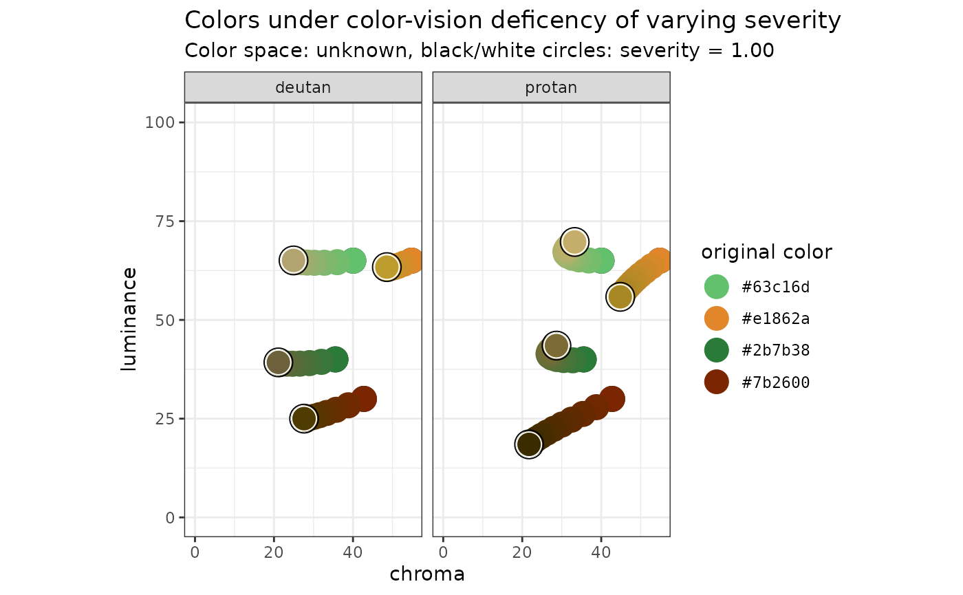
Let’s get these colors together:
categorical_mat <-
  rbind(blues_purples_mat_second, greens_oranges_mat) %>%
  `[`(c(4, 6, 3, 5, 1, 7, 2, 8), )

categorical_hex <- pth_to_hex(categorical_mat)

colorspace::swatchplot(categorical_hex, cvd = TRUE)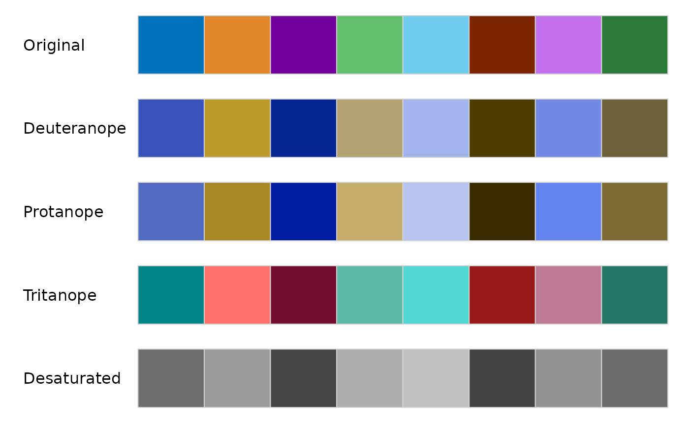
show_col(categorical_hex)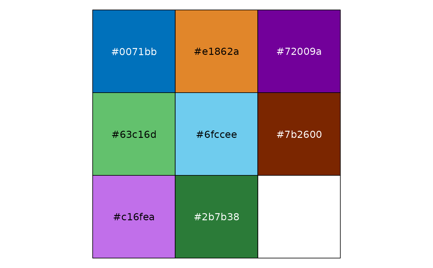
Our next task is to see the performance of the categorical palette, defined as the minimum distance between colors under CVD.
categorical_performance <-
  categorical_mat %>%
  pth_data_cat_euclid() %>%
  filter(hex_original_a < hex_original_b) %>%
  group_by(condition) %>%
  arrange(distance, .by_group = TRUE) %>%
  slice_head(n = 3) %>%
  print()
#> # A tibble: 12 × 7
#> # Groups:   condition [4]
#>    hex_original_a hex_original_b condition severity hex_a   hex_b   distance
#>    <chr>          <chr>          <fct>        <dbl> <chr>   <chr>      <dbl>
#>  1 #2b7b38        #63c16d        none             0 #2b7b38 #63c16d     25.4
#>  2 #72009a        #c16fea        none             0 #72009a #c16fea     30.6
#>  3 #0071bb        #6fccee        none             0 #0071bb #6fccee     36.6
#>  4 #0071bb        #72009a        deutan           1 #3655ba #072794     15.1
#>  5 #2b7b38        #7b2600        deutan           1 #6d613b #4e3c00     15.7
#>  6 #6fccee        #c16fea        deutan           1 #a2b3ee #718ce5     21.1
#>  7 #0071bb        #c16fea        protan           1 #506bbf #6385f0     13.9
#>  8 #63c16d        #e1862a        protan           1 #c4ae69 #a78825     18.1
#>  9 #2b7b38        #e1862a        protan           1 #7c6b35 #a78825     20.3
#> 10 #0071bb        #2b7b38        tritan           1 #008487 #237766     13.1
#> 11 #63c16d        #6fccee        tritan           1 #59bca7 #51d8d6     14.7
#> 12 #72009a        #7b2600        tritan           1 #740e2f #971a1b     21.8
Finally, let’s look at the highest and lowest luminance values for each condition. The motivation is that we want to stay away from the background color for both light mode and dark mode.
categorical_cvd <-
  categorical_mat %>%
  pth_data_cvd(pth_cvd_grid_severity(1)) %>%
  group_by(condition)

categorical_cvd %>%
  arrange(luminance, .by_group = TRUE) %>%
  slice_head(n = 2) %>%
  print()
#> # A tibble: 8 × 7
#> # Groups:   condition [4]
#>   condition severity hex_original luminance chroma   hue hex
#>   <fct>        <dbl> <pth_hex>        <dbl>  <dbl> <dbl> <pth_hex>
#> 1 none             0 #7b2600           30     42.8  49.5 #7b2600
#> 2 none             0 #72009a           35     53.8 300.  #72009a
#> 3 deutan           1 #7b2600           25.0   27.6  85.6 #4e3c00
#> 4 deutan           1 #72009a           26.0   58.6 260.  #072794
#> 5 protan           1 #7b2600           18.5   21.7  84.3 #3b2c00
#> 6 protan           1 #72009a           26.7   66.6 260.  #001ca1
#> 7 tritan           1 #72009a           27.4   37.1  18.3 #740e2f
#> 8 tritan           1 #7b2600           35.7   50.7  38.1 #971a1b
We can see that the #7b2600 color may be problematic in dark-mode. We need to be mindful that we have adquate separation from the luminance of the background.
categorical_cvd %>%
  arrange(desc(luminance), .by_group = TRUE) %>%
  slice_head(n = 2) %>%
  print()
#> # A tibble: 8 × 7
#> # Groups:   condition [4]
#>   condition severity hex_original luminance chroma   hue hex
#>   <fct>        <dbl> <pth_hex>        <dbl>  <dbl> <dbl> <pth_hex>
#> 1 none             0 #6fccee           75     31.6 231.  #6fccee
#> 2 none             0 #e1862a           65     54.8  67.6 #e1862a
#> 3 deutan           1 #6fccee           73.5   28.1 264.  #a2b3ee
#> 4 deutan           1 #63c16d           65.1   24.9  88.3 #b2a371
#> 5 protan           1 #6fccee           79.3   20.6 264.  #b6c4f0
#> 6 protan           1 #63c16d           69.7   33.3  87.9 #c4ae69
#> 7 tritan           1 #6fccee           75.0   30.5 203.  #51d8d6
#> 8 tritan           1 #e1862a           68.7   51.5  37.2 #ff726b
It looks like we are OK with light mode - in fact, this suggests the possibilty of using disctinct light-mode and dark-mode palettes.